LOWELL ARTS
Refreshing the brand system and experience.

OBJECTIVE
Refresh Lowell Arts branding and work to create a cohesive brand experience that reaches new audiences and signals change.
TOOLS
InDesign, Illustrator, Figma, SvGator, WIX
AUDITING
UNDERSTANDING GOALS
Throughout our audit and discovery, it was key to continue gaining a better sense of the brand, its goals, and the values they want to communicate to their audience.

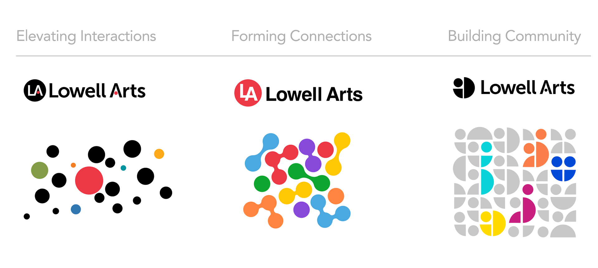
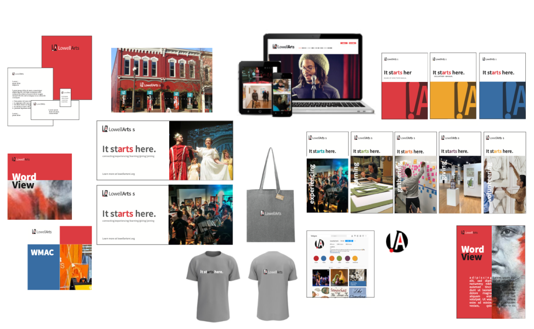
CONCEPTUAL EXPLORATIONS
Starting off a previous designers developments we had audited, we then continued working through various concepts of the brand and exploring different ideas. Going with the third concept of building community, we continued to work through the concept and further refine.
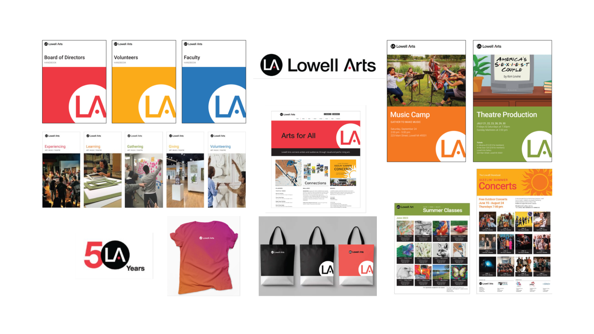
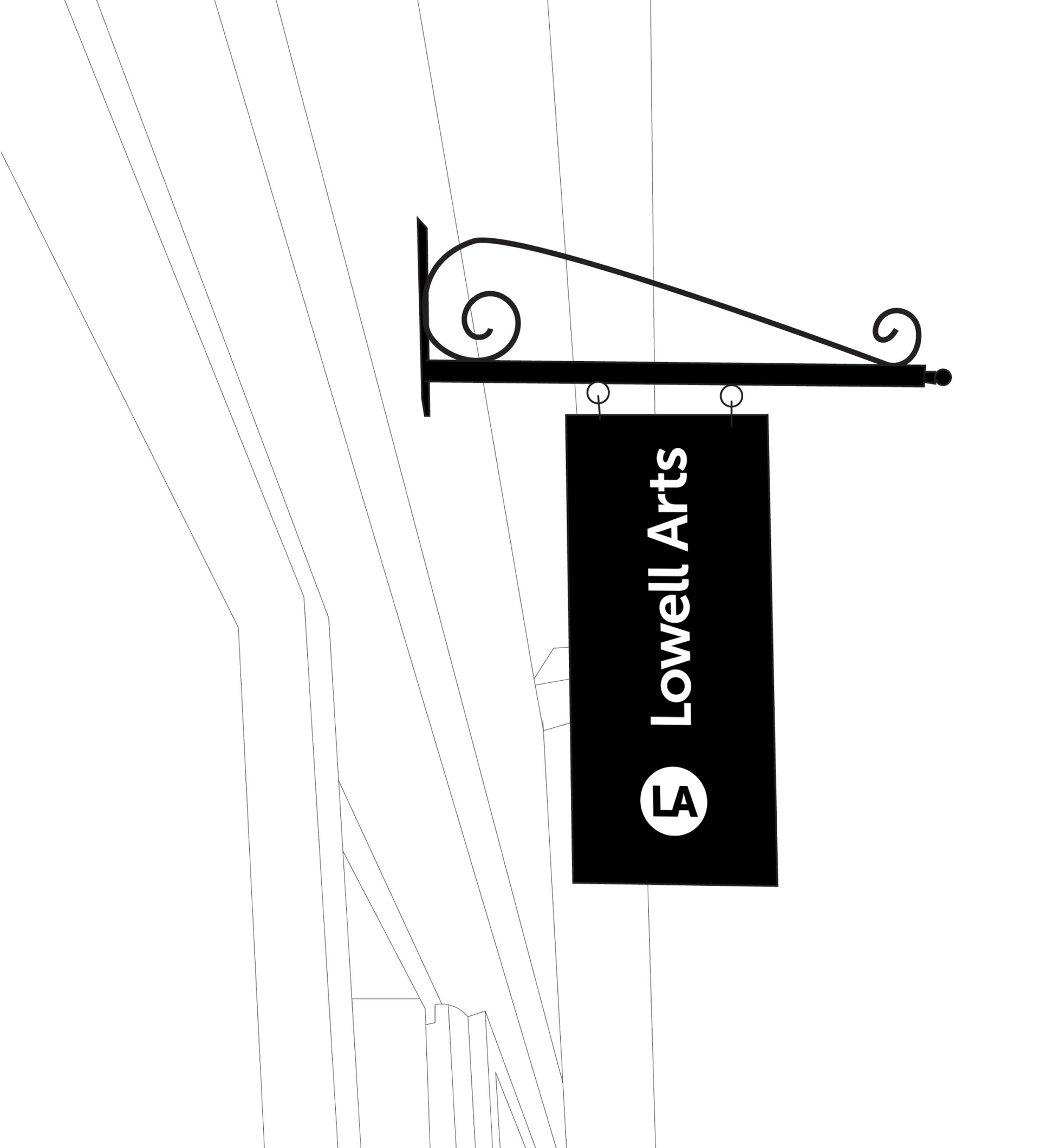
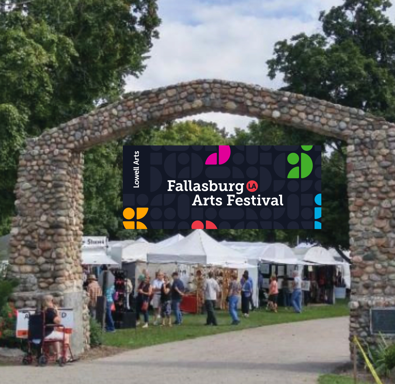
SIGNATURE
Our signature stands vertically to represent change and our upward trajectory. The vertical orientation identifies us as unique and ensures optimal visibility and impact.


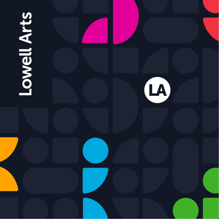
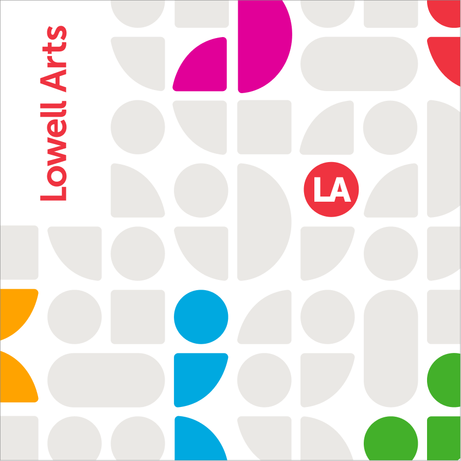

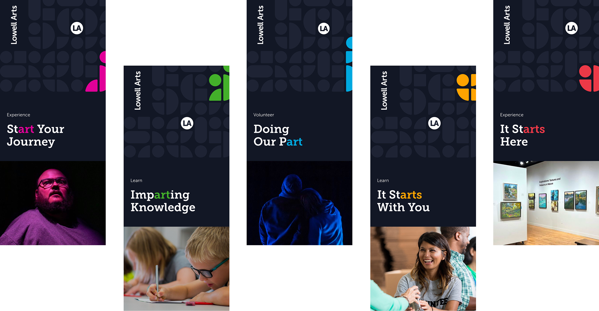
POSITIONING
When the logotype appears in the pattern, the logotype and the brandmark are separated. The placement of the bug is kinetic, but must follow the rules of the pattern. It is free to move around the pattern as long as it is closer to the right side of the pattern, not
on the edge and not crowded by any colors.
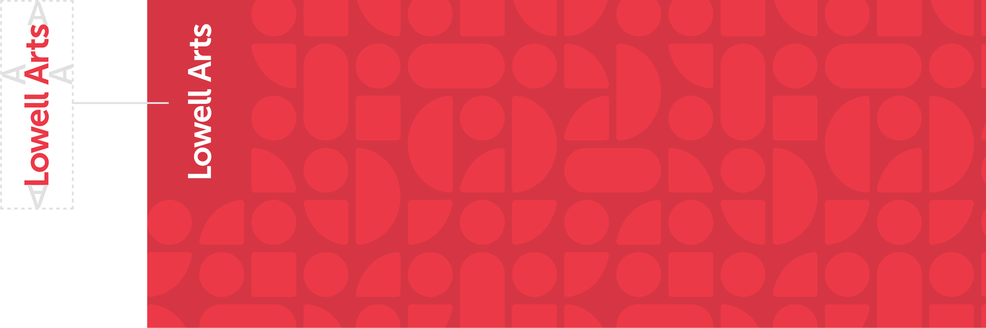
The clear space for the word mark is the equivalent of the height of the ‘A’ in Lowell Arts.
The clear space for the word mark is the equivalent of the height of the ‘A’ in Lowell Arts.
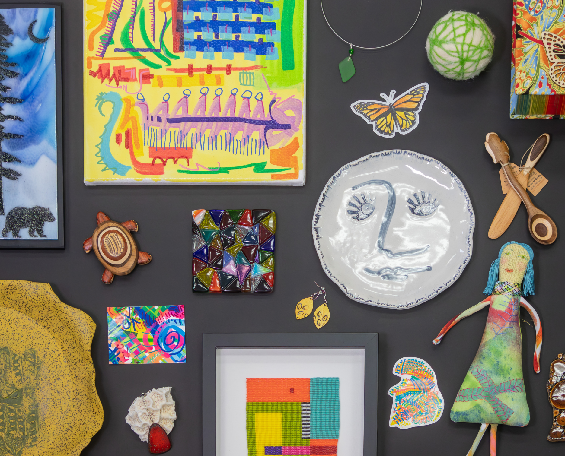
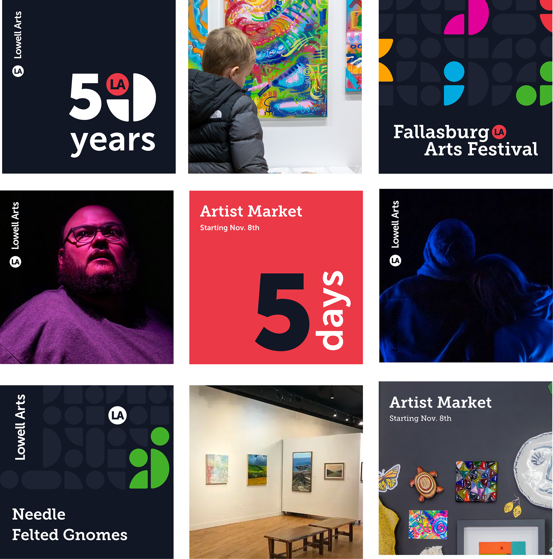
ARTIST MARKET PHOTOGRAPHY
For the Artist Market photography, it is important to
artfully display the items that are available to purchase.
The art pieces act as the pattern. Having photos with
some clear space to add text for mailers or posters can
help with the design.


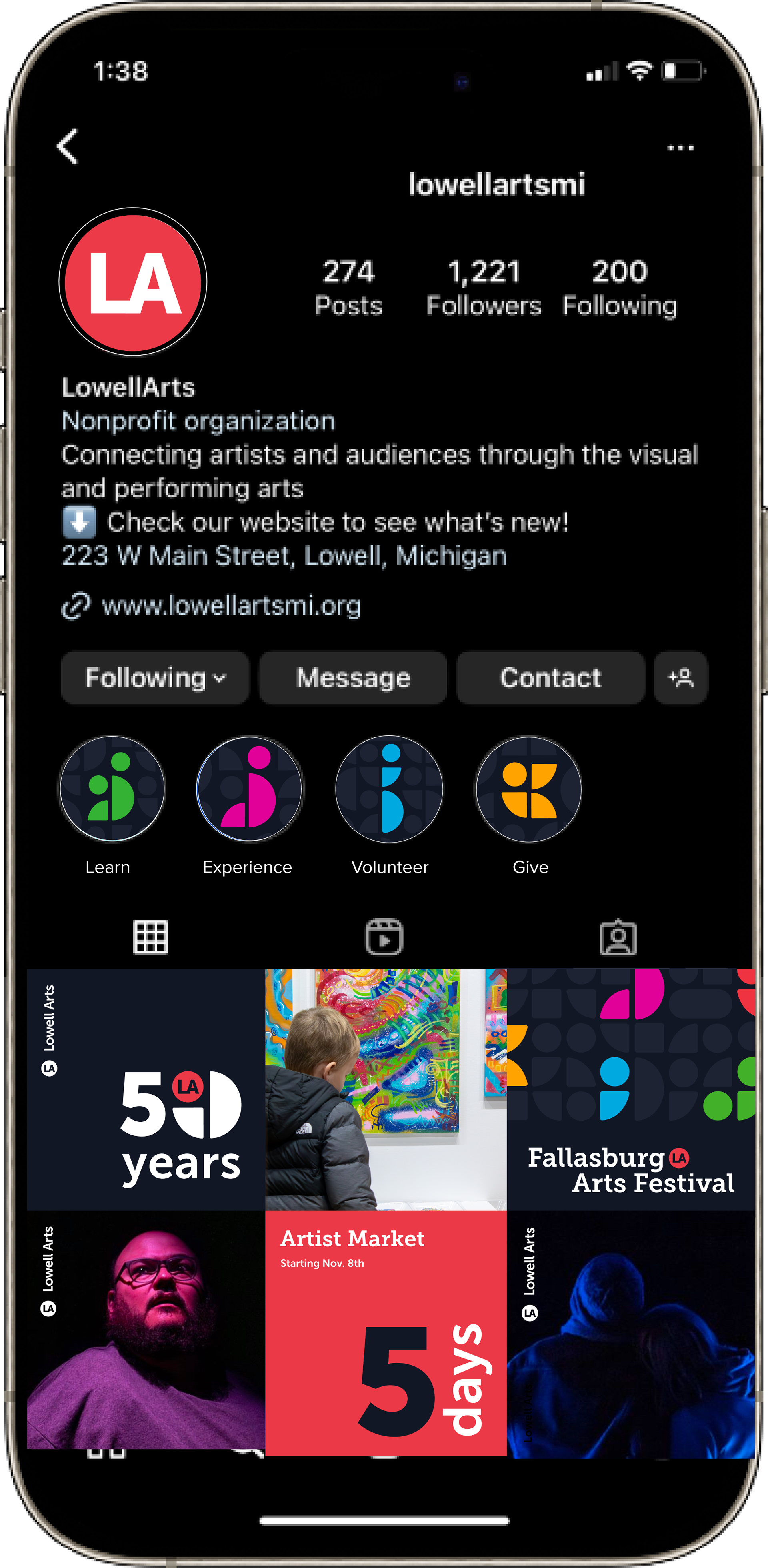
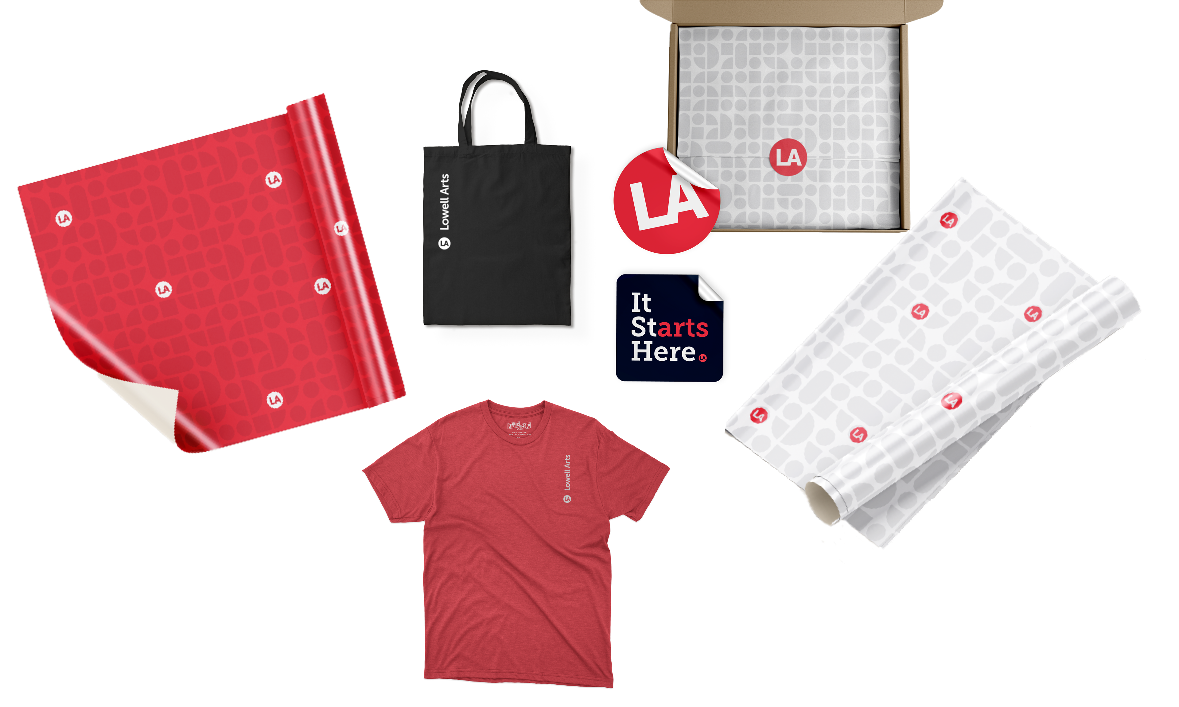
SOCIAL MEDIA
Instagram posts encourage individuals to get involved while also showcasing the various events going on.


SITE AUDITING
Auditing their current site helped to identify potential areas of improvement, as well as gaining better insight into the structure and various page types.